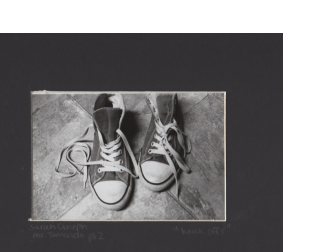
"Knock-Offs"
My title for this image is "Knock-Offs" mainly because when people look at this image they automatically think that its a picture of a pair of Converse. It is actually an image of shoes that were meant to look like Converse but are actually Levi's and costed half the price of what actual Converse would have. Therefore, I felt as though the title "Knock-Offs" was perfect for this picture. I really like this picture. Overall, the image is clear, in focus, has only one subject. I like how the shoes are sitting on the floor in between the intersections of the tile. This is definitely my favorite photograph out of everyone that I took.
My title for this image is "Knock-Offs" mainly because when people look at this image they automatically think that its a picture of a pair of Converse. It is actually an image of shoes that were meant to look like Converse but are actually Levi's and costed half the price of what actual Converse would have. Therefore, I felt as though the title "Knock-Offs" was perfect for this picture. I really like this picture. Overall, the image is clear, in focus, has only one subject. I like how the shoes are sitting on the floor in between the intersections of the tile. This is definitely my favorite photograph out of everyone that I took.
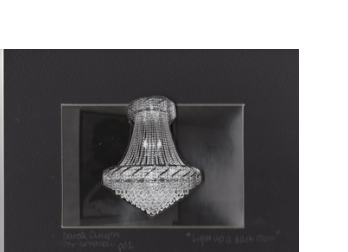
"Light Up a Dark Room"
Although you can't really tell from the scan, this picture has a pop up chandelier. I like the pop up chandelier in this image because when you look at the image it kind of looks like you are actually in the room and the 3D aspect of the chandelier just makes the image look a lot better in my opinion. To be honest, this is my second favorite picture, however; I feel as though this picture can use a lot of work as well. I think I should have done a better job cutting the chandelier out and maybe made the image a little lighter.
Although you can't really tell from the scan, this picture has a pop up chandelier. I like the pop up chandelier in this image because when you look at the image it kind of looks like you are actually in the room and the 3D aspect of the chandelier just makes the image look a lot better in my opinion. To be honest, this is my second favorite picture, however; I feel as though this picture can use a lot of work as well. I think I should have done a better job cutting the chandelier out and maybe made the image a little lighter.
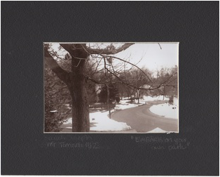
"EmBARK on your own path"
This picture was taken as an image to fill up my camera roll. I honestly didn't think this image would come out that great. I was on my way to school, and we were stopped at a bus stop and I quickly decided to pull out my camera and take a picture. This picture originally had more of the tree visible as well as more of the snow and road visible. I decided to zoom the picture in a bit since the snow was too white and created a distraction. The snow also took away from the overall quality of the image. I decided to put a sepia tone to the image because I felt as though no other effect would look good on it. I wanted to keep it as a straight print as well, but took a chance with the sepia tone. Overall, the sepia tone worked to my advantage and made the image look a lot better...almost like a postcard.
This picture was taken as an image to fill up my camera roll. I honestly didn't think this image would come out that great. I was on my way to school, and we were stopped at a bus stop and I quickly decided to pull out my camera and take a picture. This picture originally had more of the tree visible as well as more of the snow and road visible. I decided to zoom the picture in a bit since the snow was too white and created a distraction. The snow also took away from the overall quality of the image. I decided to put a sepia tone to the image because I felt as though no other effect would look good on it. I wanted to keep it as a straight print as well, but took a chance with the sepia tone. Overall, the sepia tone worked to my advantage and made the image look a lot better...almost like a postcard.
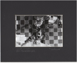
"Confusion"
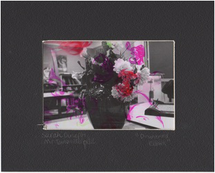
"Disoriented Colors"
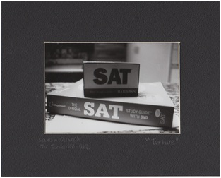
"Torture"
